Aurora Landing Page
Responsive Northern Lights landing page with animated stars, aurora glow, 3D image, and CSS effects.
Introduction
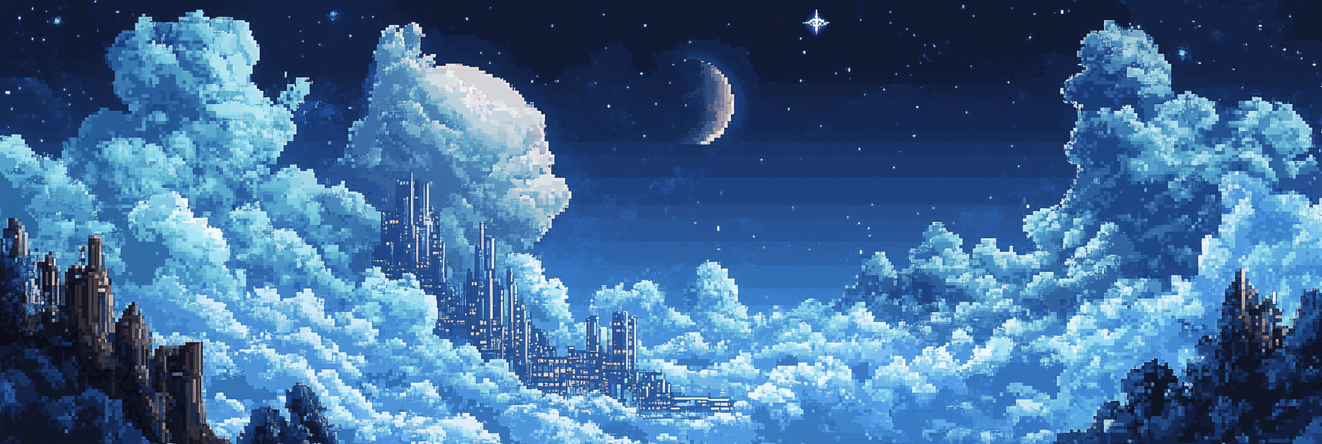
A Stunning Northern Lights Landing Page is a mesmerizing, responsive landing page featuring the aurora borealis theme with animated stars, flowing waves, and a beautiful Northern Lights image. This project demonstrates modern web design techniques including:
- Animated Starfield: Multiple layers of moving stars creating depth and atmosphere
- Aurora Glow Effects: Pulsing radial gradients simulating Northern Lights
- 3D Image Perspective: Northern Lights image with realistic 3D tilt effects
- Responsive Design: Works perfectly on all device sizes
- Modern UI: Clean navigation with glassmorphism effects
- No JavaScript Required: Pure CSS animations and interactions
The page features a dark space theme with elegant aurora colors, smooth animations, and a modern layout that displays content in an organized and visually stunning manner.
🎬 Live Result Preview
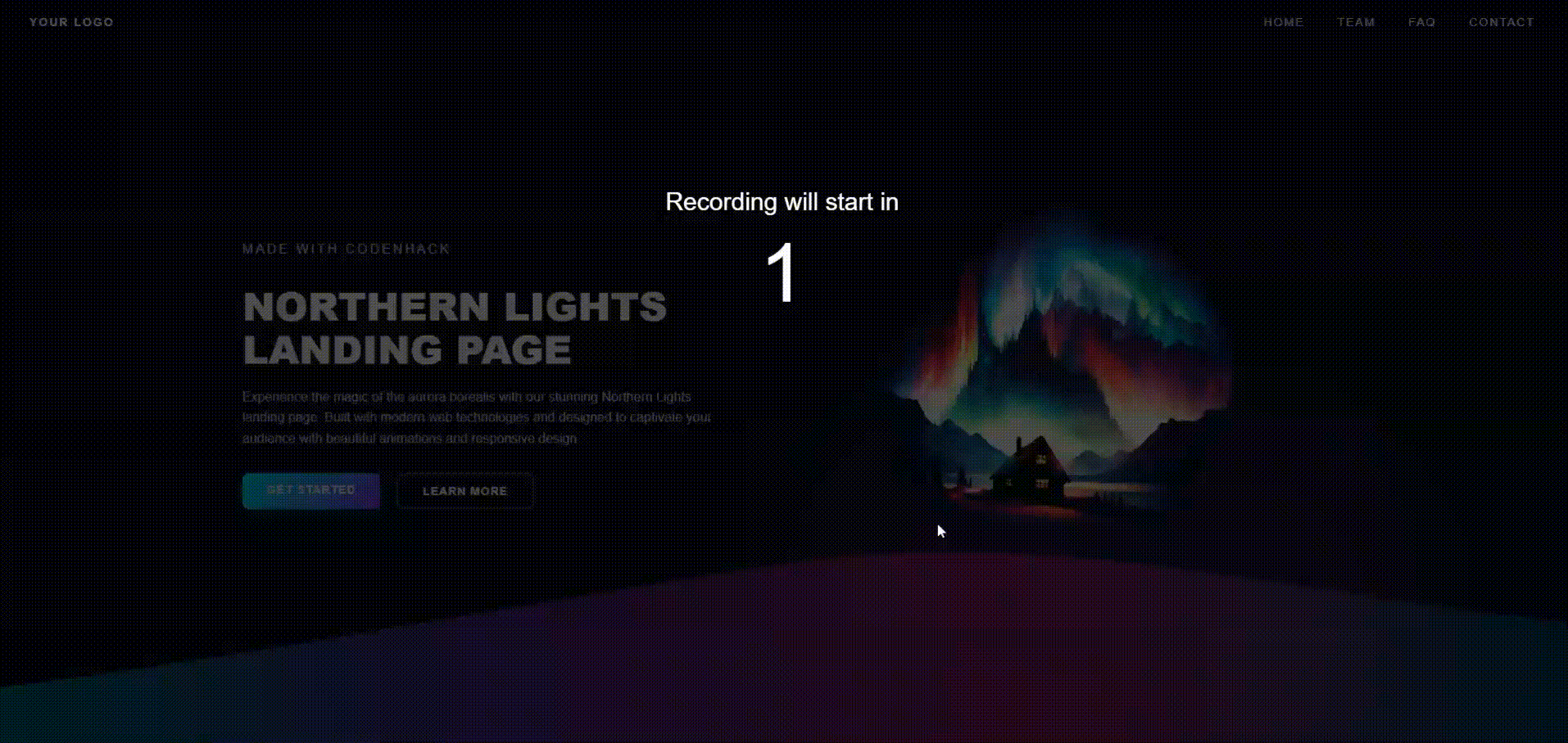
Watch the animated starfield, aurora glow effects, and 3D image perspective in action!
Key Features
- Animated Starfield: Three layers of moving stars with different speeds and opacities
- Aurora Glow Effect: Pulsing radial gradient with blur effect simulating Northern Lights
- 3D Image Perspective: Northern Lights image with realistic 3D tilt and depth
- Animated Wave: Flowing gradient wave at the bottom with smooth animation
- Responsive Design: Optimized for desktop, tablet, and mobile devices
- Modern Navigation: Glassmorphism navigation with backdrop blur effects
- Interactive Buttons: Gradient buttons with hover animations and smooth transitions
Getting Started
Prerequisites
- Basic knowledge of HTML and CSS
- Go to Hacks and create a new hack.
Project Structure
Northern Lights Landing/
├── index.html          # Main HTML structure
├── styles.css          # Complete CSS styling with animations
Quick Start
- Go to Hacks
- Create a new HTML/CSS/JS hack
- Open
index.htmlin your web browser - View the result in the preview
- Add styles to
style.cssto customize your hack
Tasks for Each Step
Step 1: HTML Structure Setup
Task: Create the basic HTML document
- Set up DOCTYPE and HTML tags
- Add meta tags for character encoding and responsive viewport
- Link external CSS stylesheet
- Create the main body structure
Code:
<!DOCTYPE html>
<html lang="en">
  <head>
    <meta charset="UTF-8" />
    <meta name="viewport" content="width=device-width, initial-scale=1.0" />
    <title>Northern Lights Landing Page</title>
    <link rel="stylesheet" href="styles.css" />
  </head>
  <body>
    <!-- Content will go here -->
  </body>
</html>
What This Achieves:
- Establishes the document foundation
- Ensures proper character encoding
- Makes the design responsive
- Links to external stylesheet
Step 2: Background Elements Structure
Task: Build the animated background system
- Create starfield layers for depth
- Add aurora glow effect container
- Set up proper HTML structure for animations
Code:
<body>
  <!-- Stars -->
  <div class="stars"></div>
  <div class="stars2"></div>
  <div class="stars3"></div>

  <!-- Aurora -->
  <div class="aurora-glow"></div>

  <!-- Main content will go here -->
</body>
What This Achieves:
- Creates layered starfield background
- Establishes aurora glow effect
- Sets up animation containers
Step 3: Navigation Section
Task: Create the navigation header
- Add logo section
- Include navigation menu items
- Create glassmorphism effect structure
Code:
<!-- Navigation -->
<nav>
  <div class="logo">YOUR LOGO</div>
  <ul>
    <li><a href="#">HOME</a></li>
    <li><a href="#">TEAM</a></li>
    <li><a href="#">FAQ</a></li>
    <li><a href="#">CONTACT</a></li>
  </ul>
</nav>
What This Achieves:
- Establishes navigation structure
- Creates menu items
- Sets up glassmorphism container
Step 4: Main Content Section
Task: Build the main content area
- Create two-column layout structure
- Add text content with heading and description
- Include call-to-action buttons
- Add Northern Lights image container
Code:
<!-- Main Content -->
<div class="content">
  <div class="content-left">
    <p class="subtitle">Made with CodenHack</p>
    <h1>NORTHERN LIGHTS <br />LANDING PAGE</h1>
    <p>
      Experience the magic of the aurora borealis with our stunning Northern
      Lights landing page. Built with modern web technologies and designed to
      captivate your audience with beautiful animations and responsive design.
    </p>

    <div class="buttons">
      <a href="#" class="btn btn-primary">Get Started</a>
      <a href="#" class="btn btn-secondary">Learn More</a>
    </div>
  </div>

  <div class="content-right">
    <div class="aurora-image">
      <img
        src="https://i.postimg.cc/y8PBfX9R/bg-f8f8f8-flat-750x-075-f-pad-750x1000-f8f8f8-removebg-preview.png"
        alt="Northern Lights"
      />
    </div>
  </div>
</div>
What This Achieves:
- Creates main content layout
- Displays text and image content
- Provides interactive buttons
- Establishes two-column structure
Step 5: Animated Wave Section
Task: Create the animated wave at the bottom
- Add SVG wave container
- Include gradient definitions
- Set up animation path
Code:
<!-- Wave -->
<div class="wave">
  <svg class="w-full h-full" viewBox="0 0 1200 200" preserveAspectRatio="none">
    <defs>
      <linearGradient id="waveGradient" x1="0%" y1="0%" x2="100%" y2="0%">
        <stop offset="0%" stop-color="rgba(0,255,255,0.4)" />
        <stop offset="30%" stop-color="rgba(138,43,226,0.5)" />
        <stop offset="70%" stop-color="rgba(255,20,147,0.4)" />
        <stop offset="100%" stop-color="rgba(0,191,255,0.3)" />
      </linearGradient>
    </defs>
    <path
      fill="url(#waveGradient)"
      d="M0,150 C200,120 400,80 600,50 C800,25 1000,80 1200,100 L1200,200 L0,200 Z"
    >
      <animate
        attributeName="d"
        dur="6s"
        repeatCount="indefinite"
        values="
      M0,150 C200,120 400,80 600,50 C800,25 1000,80 1200,100 L1200,200 L0,200 Z;
      M0,140 C200,100 400,60 600,30 C800,15 1000,70 1200,90 L1200,200 L0,200 Z;
      M0,160 C200,140 400,100 600,70 C800,35 1000,90 1200,110 L1200,200 L0,200 Z;
      M0,150 C200,120 400,80 600,50 C800,25 1000,80 1200,100 L1200,200 L0,200 Z
      "
      />
    </path>
  </svg>
</div>
What This Achieves:
- Creates animated wave effect
- Provides gradient color transitions
- Establishes smooth wave animation
Step 6: CSS Reset and Base Styles
Task: Set up CSS foundation
- Reset default browser styles
- Create dark space background
- Set up body layout and typography
Code:
/* Reset */
* {
  margin: 0;
  padding: 0;
  box-sizing: border-box;
}

body,
html {
  height: 100vh;
  min-height: 100vh;
  font-family: Arial, sans-serif;
  background: #0a0b1e;
  overflow: hidden;
}
What This Achieves:
- Removes browser inconsistencies
- Creates dark space theme
- Establishes proper layout foundation
Step 7: Starfield Animation System
Task: Create animated starfield background
- Set up three layers of stars
- Implement different animation speeds
- Create depth with varying opacities
Code:
/* Stars Animation */
@keyframes move-stars {
  from {
    transform: translateY(0px);
  }
  to {
    transform: translateY(-2000px);
  }
}

.stars,
.stars2,
.stars3 {
  position: absolute;
  top: 0;
  left: 0;
  width: 100%;
  height: 100vh;
  overflow: hidden;
}

.stars {
  background-image: radial-gradient(
      1px 1px at 20px 30px,
      rgba(255, 255, 255, 0.8),
      transparent
    ), radial-gradient(
      1px 1px at 40px 70px,
      rgba(255, 255, 255, 0.6),
      transparent
    ), radial-gradient(
      1px 1px at 90px 40px,
      rgba(255, 255, 255, 0.9),
      transparent
    ), radial-gradient(
      1px 1px at 130px 80px,
      rgba(255, 255, 255, 0.4),
      transparent
    ), radial-gradient(
      1px 1px at 160px 30px,
      rgba(255, 255, 255, 0.7),
      transparent
    ), radial-gradient(
      1px 1px at 200px 90px,
      rgba(255, 255, 255, 0.5),
      transparent
    ), radial-gradient(
      1px 1px at 240px 50px,
      rgba(255, 255, 255, 0.8),
      transparent
    ), radial-gradient(
      1px 1px at 280px 120px,
      rgba(255, 255, 255, 0.3),
      transparent
    ), radial-gradient(
      1px 1px at 320px 60px,
      rgba(255, 255, 255, 0.9),
      transparent
    ), radial-gradient(1px 1px at 360px 100px, rgba(255, 255, 255, 0.6), transparent);
  background-repeat: repeat;
  background-size: 400px 300px;
  animation: move-stars 100s linear infinite;
}

.stars2 {
  background-image: radial-gradient(
      1px 1px at 60px 80px,
      rgba(255, 255, 255, 0.4),
      transparent
    ), radial-gradient(
      1px 1px at 120px 20px,
      rgba(255, 255, 255, 0.8),
      transparent
    ), radial-gradient(
      1px 1px at 180px 110px,
      rgba(255, 255, 255, 0.5),
      transparent
    ), radial-gradient(
      1px 1px at 220px 40px,
      rgba(255, 255, 255, 0.7),
      transparent
    ), radial-gradient(
      1px 1px at 300px 80px,
      rgba(255, 255, 255, 0.3),
      transparent
    ), radial-gradient(
      1px 1px at 340px 20px,
      rgba(255, 255, 255, 0.9),
      transparent
    ), radial-gradient(1px 1px at 380px 100px, rgba(255, 255, 255, 0.6), transparent);
  background-repeat: repeat;
  background-size: 450px 350px;
  animation: move-stars 150s linear infinite;
}

.stars3 {
  background-image: radial-gradient(
      1px 1px at 100px 60px,
      rgba(255, 255, 255, 0.6),
      transparent
    ), radial-gradient(
      1px 1px at 200px 120px,
      rgba(255, 255, 255, 0.4),
      transparent
    ), radial-gradient(
      1px 1px at 300px 40px,
      rgba(255, 255, 255, 0.8),
      transparent
    ), radial-gradient(1px 1px at 400px 90px, rgba(255, 255, 255, 0.5), transparent);
  background-repeat: repeat;
  background-size: 500px 400px;
  animation: move-stars 200s linear infinite;
}
What This Achieves:
- Creates realistic starfield effect
- Establishes depth with multiple layers
- Provides smooth continuous animation
Step 8: Aurora Glow Effect
Task: Create the Northern Lights glow
- Set up radial gradient background
- Add pulsing animation
- Position and size the glow effect
Code:
/* Aurora Glow */
@keyframes aurora-pulse {
  0%,
  100% {
    transform: scale(1) rotate(0deg);
    opacity: 0.6;
  }
  25% {
    transform: scale(1.1) rotate(1deg);
    opacity: 0.8;
  }
  50% {
    transform: scale(1.05) rotate(0deg);
    opacity: 0.7;
  }
  75% {
    transform: scale(1.15) rotate(-1deg);
    opacity: 0.9;
  }
}

.aurora-glow {
  position: absolute;
  top: 50%;
  left: 50%;
  transform: translate(-50%, -50%);
  width: 800px;
  height: 600px;
  background: radial-gradient(
    ellipse at center,
    rgba(0, 255, 255, 0.15) 0%,
    rgba(138, 43, 226, 0.25) 30%,
    rgba(255, 20, 147, 0.2) 50%,
    rgba(0, 191, 255, 0.1) 70%,
    transparent 85%
  );
  filter: blur(60px);
  animation: aurora-pulse 8s ease-in-out infinite;
  transform-origin: center;
}
What This Achieves:
- Creates Northern Lights atmosphere
- Provides pulsing glow effect
- Establishes aurora color scheme
Step 9: Navigation Styling
Task: Style the navigation with glassmorphism
- Create fixed navigation header
- Add glassmorphism effects with backdrop blur
- Style navigation items and logo
Code:
/* Nav */
nav {
  position: fixed;
  top: 0;
  left: 0;
  right: 0;
  z-index: 20;
  display: flex;
  justify-content: space-between;
  align-items: center;
  padding: 20px 40px;
  color: white;
  background: rgba(10, 11, 30, 0.9);
  backdrop-filter: blur(15px);
  box-shadow: 0 4px 20px rgba(0, 0, 0, 0.3);
  border-bottom: 1px solid rgba(255, 255, 255, 0.1);
}

nav .logo {
  font-size: 14px;
  font-weight: bold;
  letter-spacing: 2px;
}

nav ul {
  display: flex;
  gap: 40px;
  list-style: none;
}

nav a {
  color: white;
  font-size: 14px;
  font-weight: 500;
  text-decoration: none;
  letter-spacing: 2px;
  transition: opacity 0.3s ease;
}

nav a:hover {
  opacity: 0.7;
}
What This Achieves:
- Creates modern glassmorphism navigation
- Provides smooth hover effects
- Establishes professional header design
Step 10: Content Layout System
Task: Style the main content area
- Create two-column flexbox layout
- Style headings and text content
- Add proper spacing and typography
Code:
/* Content */
.content {
  position: relative;
  z-index: 10;
  height: 100vh;
  display: flex;
  align-items: center;
  max-width: 1400px;
  padding: 0 40px;
  margin: 0 auto;
  overflow: hidden;
  justify-content: space-between;
  gap: 40px;
}

.content-left {
  flex: 1;
  max-width: 600px;
  min-width: 0;
}

.content-right {
  flex: 1;
  display: flex;
  justify-content: center;
  align-items: center;
  position: relative;
  min-width: 0;
}

.content h1 {
  color: white;
  font-size: 48px;
  font-weight: 900;
  line-height: 1.1;
  margin-bottom: 20px;
  text-shadow: 0 0 30px rgba(255, 255, 255, 0.1);
}

.subtitle {
  color: #aaa;
  text-transform: uppercase;
  letter-spacing: 3px;
  font-size: 12px;
  margin-bottom: 10px;
}

.content p {
  color: #ccc;
  font-size: 16px;
  line-height: 1.6;
  max-width: 600px;
  margin-bottom: 30px;
}
What This Achieves:
- Creates responsive content layout
- Establishes proper typography hierarchy
- Provides balanced two-column design
Step 11: Button System
Task: Create interactive buttons
- Design primary and secondary button styles
- Add hover effects and transitions
- Create gradient backgrounds
Code:
/* Buttons */
.buttons {
  display: flex;
  gap: 20px;
  margin-top: 20px;
}

.btn {
  padding: 12px 30px;
  border: none;
  border-radius: 8px;
  font-size: 14px;
  font-weight: 600;
  text-transform: uppercase;
  letter-spacing: 1px;
  cursor: pointer;
  transition: all 0.3s ease;
  text-decoration: none;
  display: inline-block;
}

.btn-primary {
  background: linear-gradient(135deg, #00ffff, #8a2be2);
  color: white;
  box-shadow: 0 4px 15px rgba(0, 255, 255, 0.3);
}

.btn-primary:hover {
  transform: translateY(-2px);
  box-shadow: 0 6px 20px rgba(0, 255, 255, 0.4);
}

.btn-secondary {
  background: transparent;
  color: white;
  border: 2px solid rgba(255, 255, 255, 0.3);
}

.btn-secondary:hover {
  background: rgba(255, 255, 255, 0.1);
  border-color: rgba(255, 255, 255, 0.5);
}
What This Achieves:
- Creates interactive button system
- Provides visual feedback on hover
- Establishes call-to-action elements
Step 12: 3D Image Perspective
Task: Style the Northern Lights image
- Create 3D perspective effect
- Add image styling and positioning
- Implement background removal effects
Code:
/* Northern Lights Image */
.aurora-image {
  width: 450px;
  height: 360px;
  position: relative;
  z-index: 5;
  display: flex;
  align-items: center;
  justify-content: center;
  border-radius: 20px;
  overflow: visible;
  margin-top: -20px;
}

.aurora-image img {
  width: 100%;
  height: auto;
  object-fit: contain;
  border-radius: 20px;
  mix-blend-mode: screen;
  filter: brightness(1.2) contrast(1.1);
  transform: perspective(1000px) rotateY(-15deg) rotateX(5deg);
}
What This Achieves:
- Creates realistic 3D image effect
- Removes white background from image
- Establishes visual depth and perspective
Step 13: Animated Wave System
Task: Style the bottom wave
- Position the wave at the bottom
- Set up proper z-index layering
- Ensure wave visibility
Code:
/* Wave */
.wave {
  position: absolute;
  bottom: 0;
  left: 0;
  width: 100%;
  z-index: 10;
  opacity: 1;
}
What This Achieves:
- Positions animated wave at bottom
- Establishes proper layering
- Completes the visual design
Step 14: Responsive Design System
Task: Make the design mobile-friendly
- Add media queries for different screen sizes
- Adjust layout for mobile devices
- Optimize image sizes and spacing
Code:
/* Tablet */
@media (max-width: 1024px) {
  .content {
    padding: 80px 60px 0 60px;
  }

  .aurora-image {
    width: 400px;
    height: 320px;
  }
}

/* Mobile */
@media (max-width: 768px) {
  .aurora-glow {
    width: 100%;
    height: 300px;
    left: 0;
    filter: blur(40px);
  }

  .content {
    flex-direction: column;
    text-align: center;
    padding: 80px 20px 0 20px;
    max-width: 100%;
    margin: 0;
  }

  .content-left {
    max-width: 100%;
    margin-bottom: 40px;
  }

  .content-right {
    order: -1;
  }

  .aurora-image {
    width: 300px;
    height: 240px;
  }

  .aurora-image img {
    transform: perspective(800px) rotateY(-10deg) rotateX(3deg);
  }

  .content h1 {
    font-size: 36px;
  }

  .content p {
    font-size: 14px;
  }

  .buttons {
    flex-direction: column;
    gap: 15px;
  }

  .btn {
    text-align: center;
    width: 100%;
    padding: 14px 20px;
  }

  nav {
    padding: 15px 20px;
  }

  nav ul {
    display: none;
  }
}

/* Small Mobile */
@media (max-width: 480px) {
  .content {
    padding: 0 15px 0 15px;
  }

  .aurora-image {
    width: 250px;
    height: 180px;
  }

  .aurora-image img {
    transform: perspective(600px) rotateY(-8deg) rotateX(2deg);
  }

  .content h1 {
    font-size: 28px;
  }

  .content p {
    font-size: 13px;
  }

  .btn {
    padding: 12px 16px;
    font-size: 13px;
  }
}
What This Achieves:
- Creates mobile-responsive design
- Optimizes layout for different screens
- Maintains visual quality across devices
Conclusion
What You've Accomplished
By following these steps, you've created a stunning landing page that demonstrates:
- Advanced CSS Animations: Starfield, aurora glow, and wave animations
- 3D Visual Effects: Perspective transforms and depth
- Responsive Design: Mobile-first approach with multiple breakpoints
- Modern UI Elements: Glassmorphism navigation and gradient buttons
- No JavaScript Required: Pure CSS solution for better performance
Key Learning Outcomes
- CSS Animation: Keyframe animations and transitions
- 3D Transforms: Perspective and rotation effects
- Responsive Design: Mobile-first media queries
- Visual Effects: Gradients, blur, and backdrop filters
- Performance: Hardware acceleration and optimization
Technical Benefits
- Fast Loading: No external JavaScript dependencies
- Easy Maintenance: Simple HTML and CSS structure
- Cross-Platform: Works on all modern browsers
- Scalable: Easy to modify and extend
- Professional: Suitable for business and portfolio use
Built with ❤️ using only HTML & CSS - Perfect for Modern Web Design!